

MULTI-BRAND ARCHITECTURE
Architected a multi-brand Design System and rebuilt the end-to-end UX for a global consultation ecosystem spanning 4 consumer marketplaces and a B2B provider portal. Established a 3-tier token architecture and streamlined DesignOps workflows that drastically reduced engineering overhead, unified cross-platform consistency, and accelerated multi-tenant scaling.
Executive Summary
The company operated a high-volume, real-time 1-on-1 consultation marketplace (voice, video, and live chat) across 4 distinct consumer brands, supported by a B2B provider portal and a heavy digital marketing engine. Without an existing design system, product development suffered from massive technical debt, inconsistent user journeys, and high engineering overhead.
I led the multi-brand Design System architecture and complete UX restructuring for this entire ecosystem. By establishing a scalable multi-theme token architecture and cross-functional DesignOps workflows, we streamlined engineering delivery, unified cross-platform UX consistency, and accelerated business growth.
Key Impact & Results
⚡ Dev Velocity: Reduced feature shipping times significantly across all 4 brands by eliminating duplicate UI work and standardizing component logic.
📈 Revenue & Conversion: Drove substantial growth in user signups and checkout completion rates through friction-free UX flows.
📉 Marketing Efficiency: Lowered Customer Acquisition Costs (CAC) by deploying modular, high-converting landing page frameworks.
🏗️ Future-Proof Scalability: Built a multi-tenant visual architecture capable of launching new niche marketplace verticals in days rather than months.

Context & The Challenge
1. Fragmented Technical & Design Ecosystem
The ecosystem lacked any central system or shared standards. Each of the 4 B2C marketplaces operated on siloed visual codebases with inconsistent components. Every minor feature update had to be designed and coded up to four separate times.
2. High-Stress, Immediate-Intent User Base
Users entering the platform are seeking immediate, sensitive advisory services. The interface required extreme clarity, absolute trust signals, and zero interaction friction—especially during real-time matching, live video/voice initiation, and wallet checkout.
3. Disconnected B2B & Marketing Tools
The B2B provider dashboard lacked intuitive tools for experts to manage schedules and live calls. Meanwhile, marketing landing pages were high-cost and slow to build, with low reusable modularity.
Strategic Approach & DesignOps Transformation
To succeed, this project could not just be a library of Figma components—it required reorganizing how Product, Design, and Engineering worked together.
Audited & Consolidated: Scraped every existing layout across all 4 sites to catalog UI variations, redundant CSS, and broken UX flows.
Established Shared Governance: Held weekly cross-functional alignment sessions with Frontend Leads and Product Managers to define token structures and component APIs.
Figma-to-Code Parity: Designed a 1:1 component hierarchy between Figma and frontend code repositories (React / Web Components), establishing strict handoff and QA protocols.
Dynamic Theming System: Designed a 3-tier token architecture (Global → Semantic → Component) that allowed a single core component logic to dynamically adapt to 4 different visual brand identities and a high-density B2B interface.
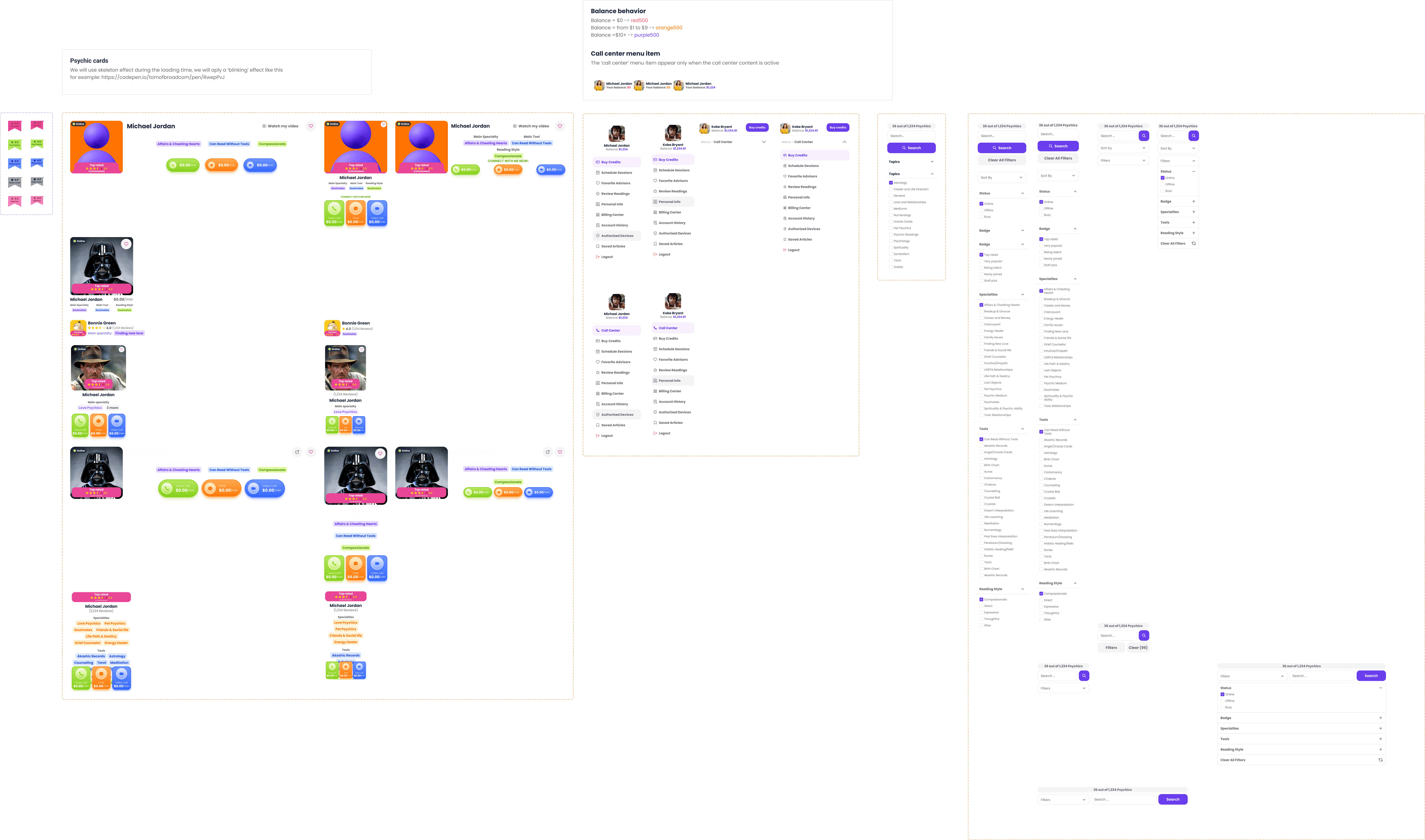
Core UX Re-Architecture
Beyond visual consistency, I mapped, tested, and rebuilt the complete user architecture from scratch:
1. Zero-Friction Onboarding & Discovery
Streamlined the expert filtering system to help users find the exact advice they need instantly.
Implemented real-time availability indicators so users could connect with available advisors without navigating dead ends.
2. High-Trust Real-Time Connection Engine
Simplified the session initiation flow for live video/voice calls and chat rooms.
Reduced onboarding drop-offs by providing clear status states during connection loading and balance validation.

3. The B2B Service Provider Portal
Adaptable Density: Leveraged the core design system's high-density component tokens optimized for complex dashboards, ensuring the UI scaled perfectly from consumer-friendly browsing to professional B2B management tools.
Streamlined Operations: Gave experts intuitive tools to manage their availability, interact with clients, and track their financial analytics.
4. Frictionless Micro-Transactions & Marketing Engine
Wallet & Checkout UX: Redesigned the top-up and credit system to make pricing transparent, eliminating unexpected session cuts and boosting repeat billing conversion.
Marketing Modular Engine: Created a component section framework for marketing teams, allowing them to spin up conversion-optimized landing pages without developer intervention.
Impact & Takeaways
By treating the Design System as an infrastructure project rather than a visual exercise, the company achieved a total operational transformation. Code duplication across the 4 consumer platforms dropped drastically, freeing engineers to focus on backend reliability and real-time streaming performance. The unified architecture not only drove measurable business growth in conversion and retention but also provided the foundation to launch future niche platforms at a fraction of the cost.